18 Dec 2018 Pantone Color of the Year: Our Thoughts
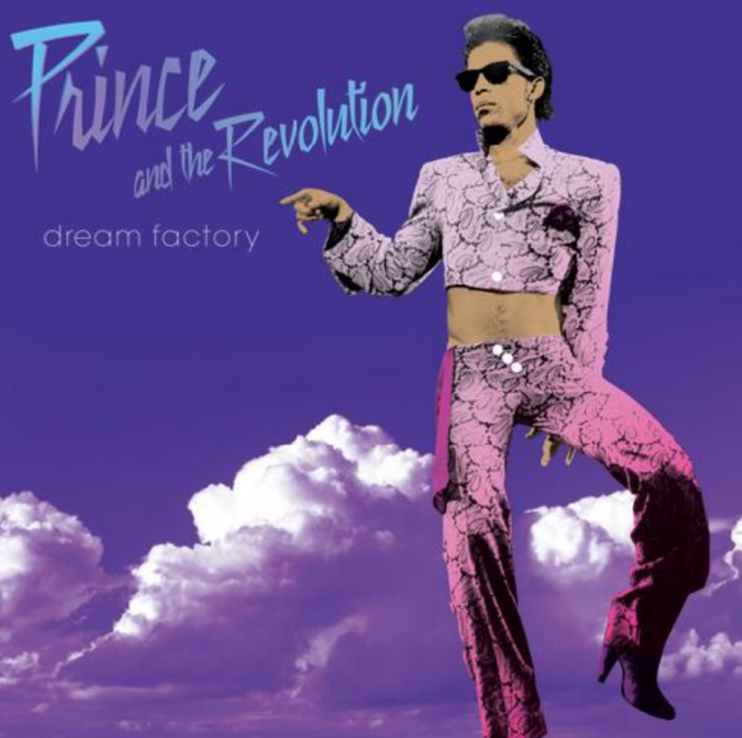
The year of greenery has come to an end and has been replaced by an equally bright but significantly more celestial hue: Ultra Violet. Pantone 18-3838 brings to mind a Prince album cover, the reflections of an amethyst crystal, and a pretty resounding “why?” from the Design by Misha team.
While Ultra Violet is by no means a bad color, we doubt it will successfully dominate design trends throughout 2018 and beyond. It seems Ultra Violet was chosen to inspire intangible hope as opposed to forecast where the design world is headed. This color choice feeds into our world of fast fashion and “trendy” design as opposed to inspiring timeless design and longevity.
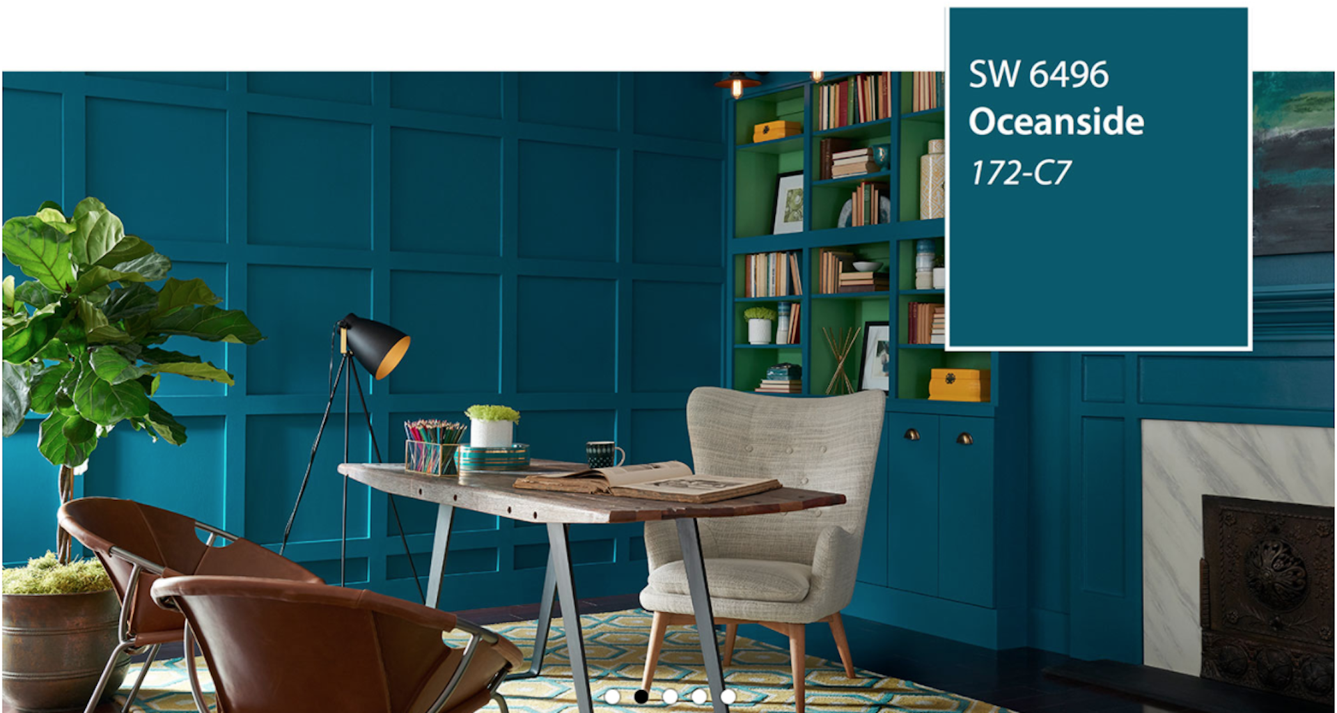
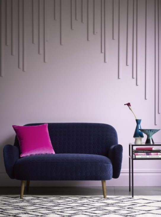
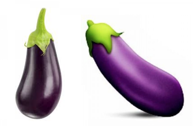
We would have guessed the Pantone color of the year would lean more towards the jewel tones, like Sherwin Williams choice of Oceanside did. A natural aubergine hue is what we had predicted the color of the year would be. Instead, Pantone went ahead and skipped that rich aubergine tone and went straight for the bright eggplant emoji purple.
That being said, the Pantone color of the year will influence style and design trends pretty much no matter what the color or the year. We’re bracing ourselves for the sudden increase in bright purple accent walls, plush violet upholstery and just a lot of purple in general. What are your thoughts on the 2018 Pantone color of the year?