


6 Jun 4 Stylish Ways to Use Neutral Colors in Interior Design
Neutral colors in interior design have been making headlines lately. And rightfully so. There’s probably no better way to turn up the style quotient of your interiors while keeping it elegant, chic, yet minimalistic.
Here are four ways to set the mood and turn up the style factor with the right trend-setting neutral colors in your interior design – in a way that fits your personal style.
Read on to get in the know. We share our practical expert advice, mixed with some flights of fancy. Getting that coveted designer mag style was never easier. Spring 2018, we’re ready for ya!
#1 – Total White Out
The secret to creating a dreamy all-white bedroom (that you’ll never want to leave) lies within the use of textures. Starting with a blank canvas of white walls and some crisp white bed linens, layer on other white accents in varying materials and weights.
We can’t get enough of those chunky knit throws, even as the weather warms up, so why not toss one over the foot of your bed or over a side chair to add a bit of cozy visual interest? Keep texture in mind when selecting upholstery fabrics for headboards, the weave or pile of an area rug, or even the material of your window coverings. You’ll be sleeping on a white cloud in no time.
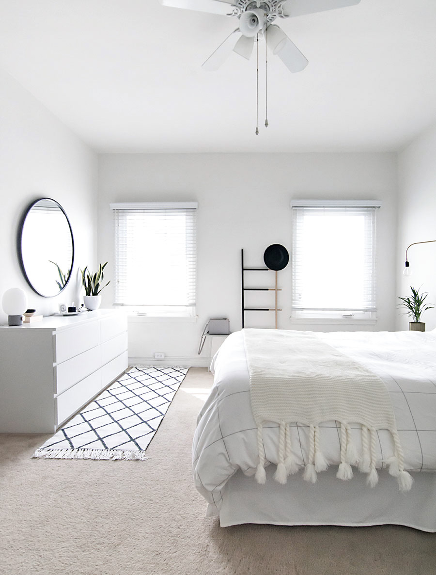
Source: Homeyohmy
#2 – Blush for Days
We’re here for it, blush is the new neutral color in interior design. Not one to be shy about our love for a glass of Rose’, it makes us happy to see this lovely hue splashed onto walls as a brilliantly updated neutral. The versatility of using the blush tone in your home design is endless.
This color isn’t just for Pinterest worthy baby nursery design anymore. We are loving how this blush kitchen accent wall is giving us Venetian plaster vibes but still feels oh so down to earth and charming. Mixing blush with metallics can really make things glow. Blush is here to bring the warmth, washing walls with lovely Springtime hues.

Source: ApartmentTherapy
#3 – Greige is the New Norm
There’s a reason the term “greige” (or grey/beige) has become so widely used recently. Utilizing grey tones and beiges is a more up-to-date way to incorporate neutral colors into your interior design.
Gone are the days of bland vanilla walls. Don’t be afraid to mix some warm and cool colors in your design to keep visual interest. If you’re working with a warmer wood tone furniture piece, a cool grey accent will make it feel uber contemporary.
Make the most of this on-trend phenomenon by using a paint color like Sherwin Williams “Perfect Greige” SW-6073. We’re on board, are you?
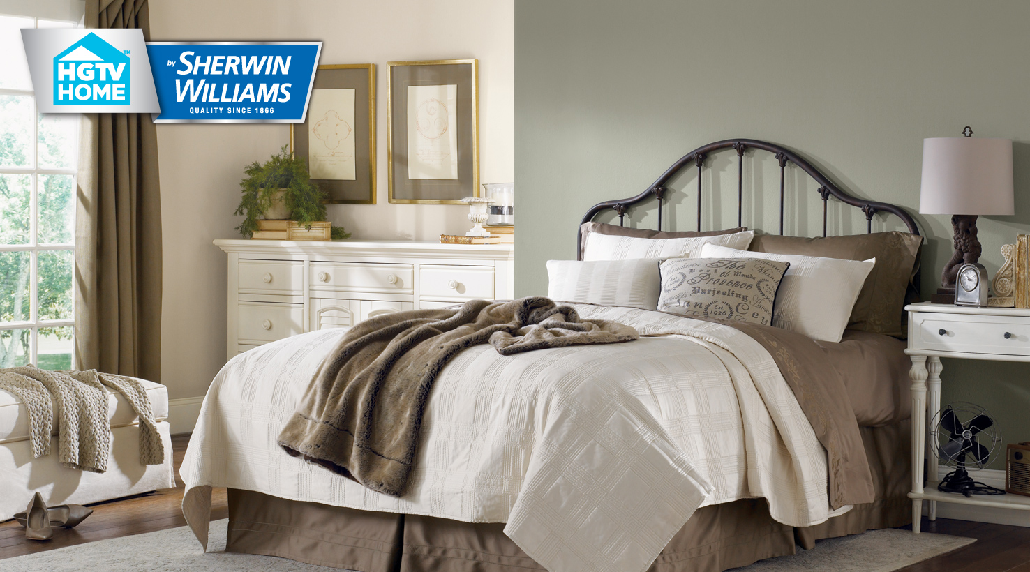
Source: Sherwin-Williams
Another favorite Greige, pictured here, is “Escape Grey” SW-6185.
#4 – Light and Shadow Play
Sometimes the best way to show off fabulous architectural detail is with a neutral color in interior design. When the walls, floors, and ceiling are in the same hue, light and shadows are better able to play off of any unique features, like the vaulted ceilings in this to die for Paris apartment.
When selecting the right neutral for your space, make sure to utilize a paint test swatch first, and we don’t mean those cute colorful cards from Home Depot. Try painting a piece of cardboard with the color(s) so that you can view a larger surface area and have the ability to hold it up in different places without painting swatches all over the house.
Remember natural lighting makes a difference, so be sure to view your swatch at various times of day to be sure your happy with it. And with a beautiful neutral pallet, how could you not be?
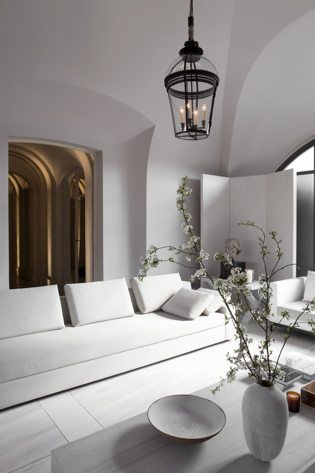
Source: ArchitecturalDigest